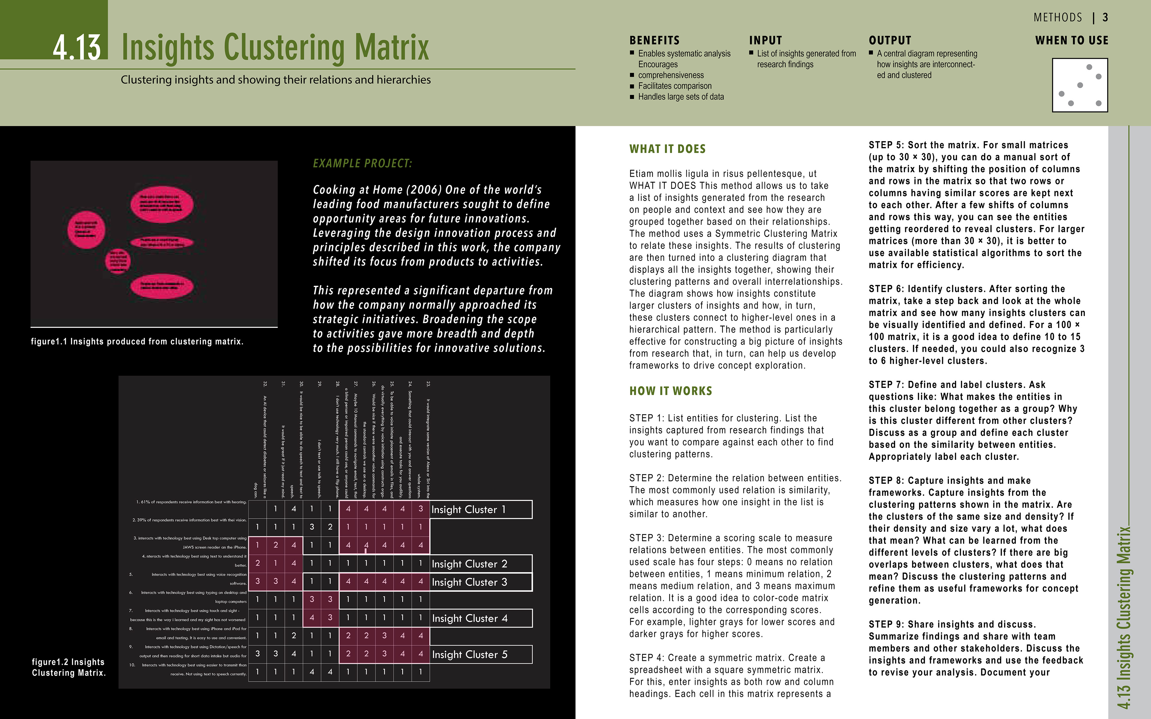
I found the Insight Clustering matrix to be much work and not especially insightful. However, It did give me some ideas on how to design a better research method within the visual context of a matrix.
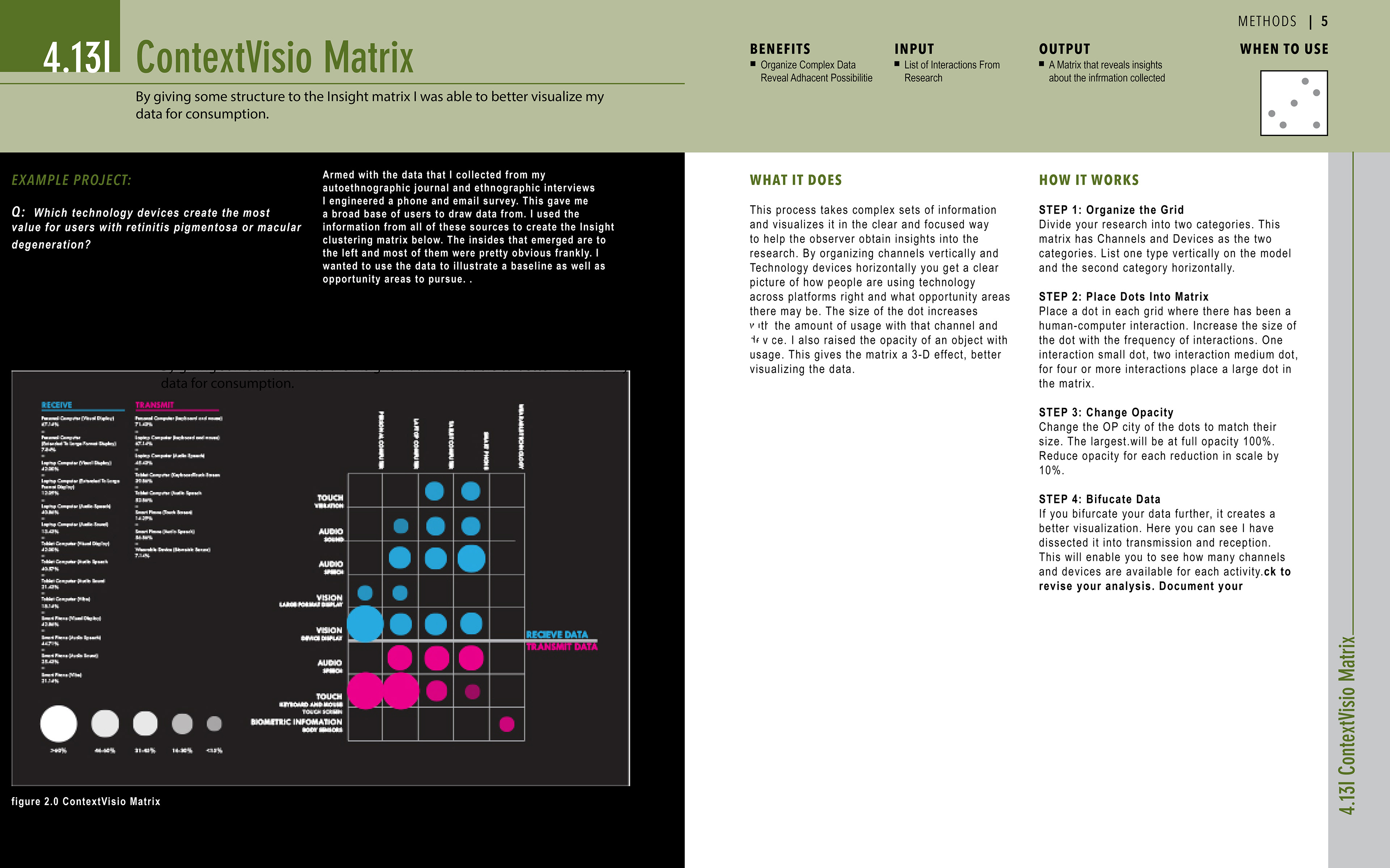
Having studied the data, I created a matrix with devices on one access and interactions on another. Then I bifurcated the matrix into the transmission of data and reception of data. This created a visualization which better represented the research question. How do people with retinitis pigmentosa best interact with technology devices today?
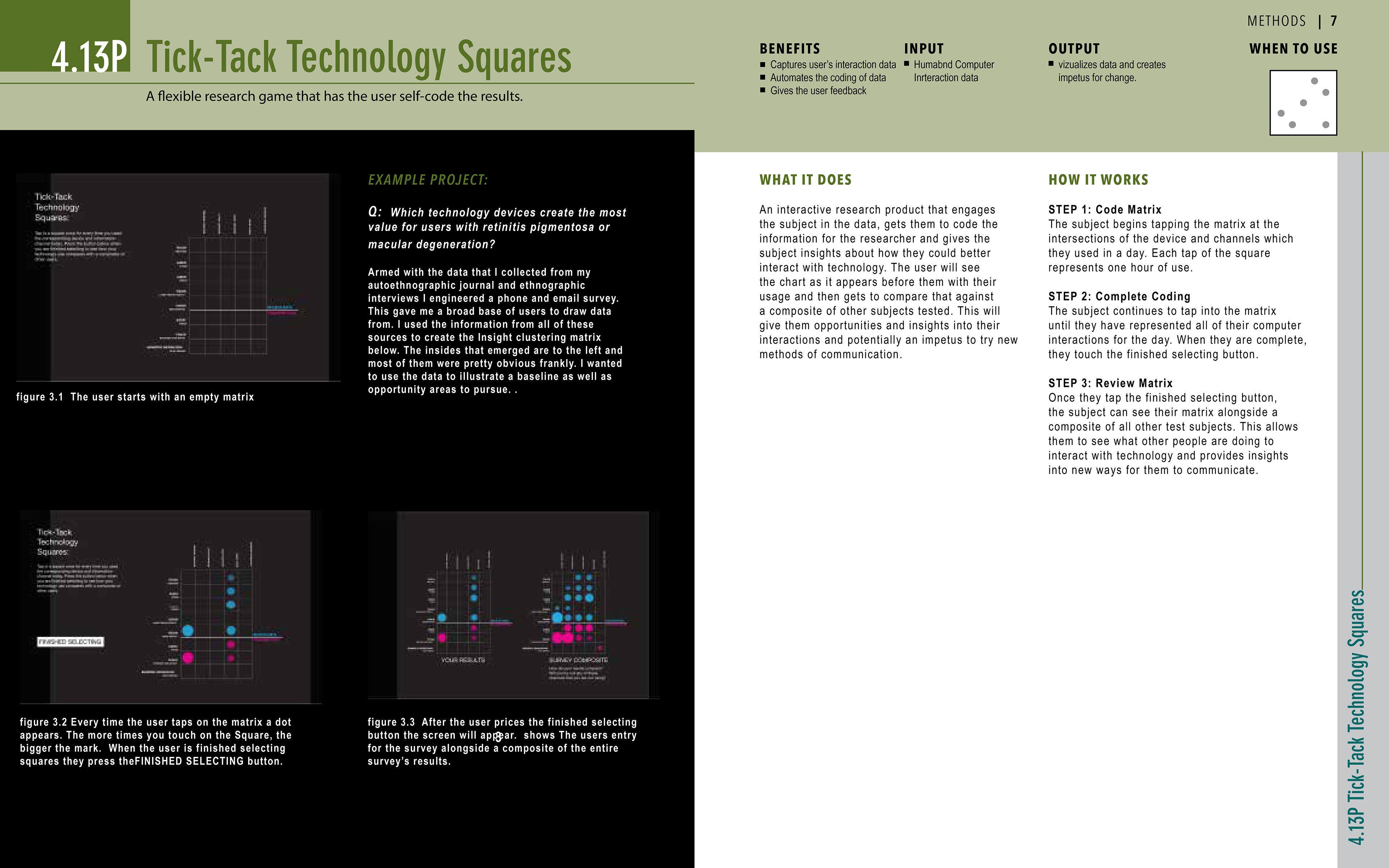
Then I created an interactive product that starts out as an empty matrix. Users tap on matrix squares every time they have performed an interaction that day. When the user is finished tapping on squares, they hit the finish button, and the survey populates with their answers alongside the responses of all other users. In this, they can see how they might better interact with technology personally.
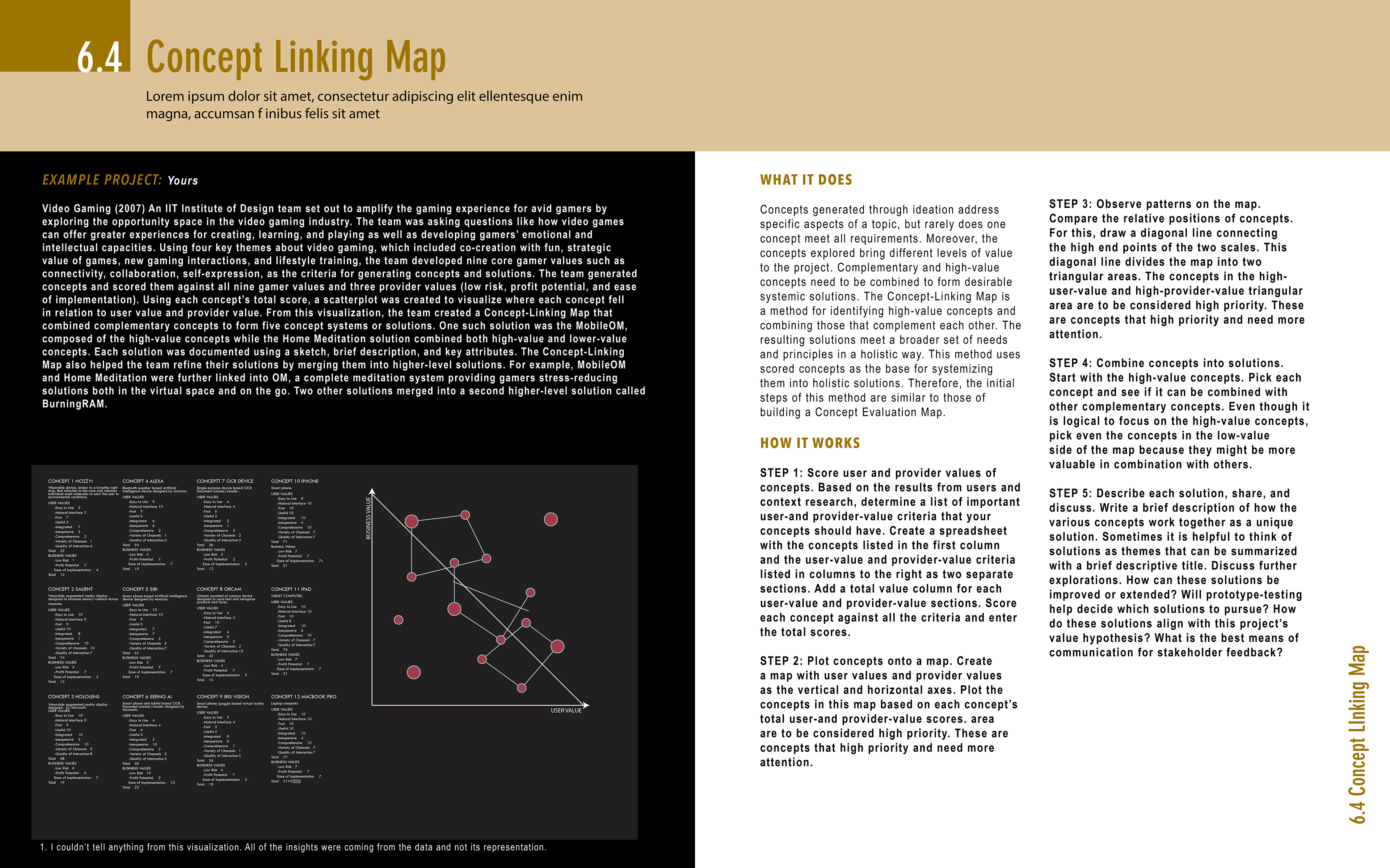
After running this method, I found it equally nebulous to the first method I tried. It’s hard to see with the relationship is between different concepts on the map and how that would impact product design decisions.

My solution was to develop a map where each concept is separated into two parts, and the ideas converge on a center point as the score goes up. This created a measurable visualization that accurately represents the problem to be answered.
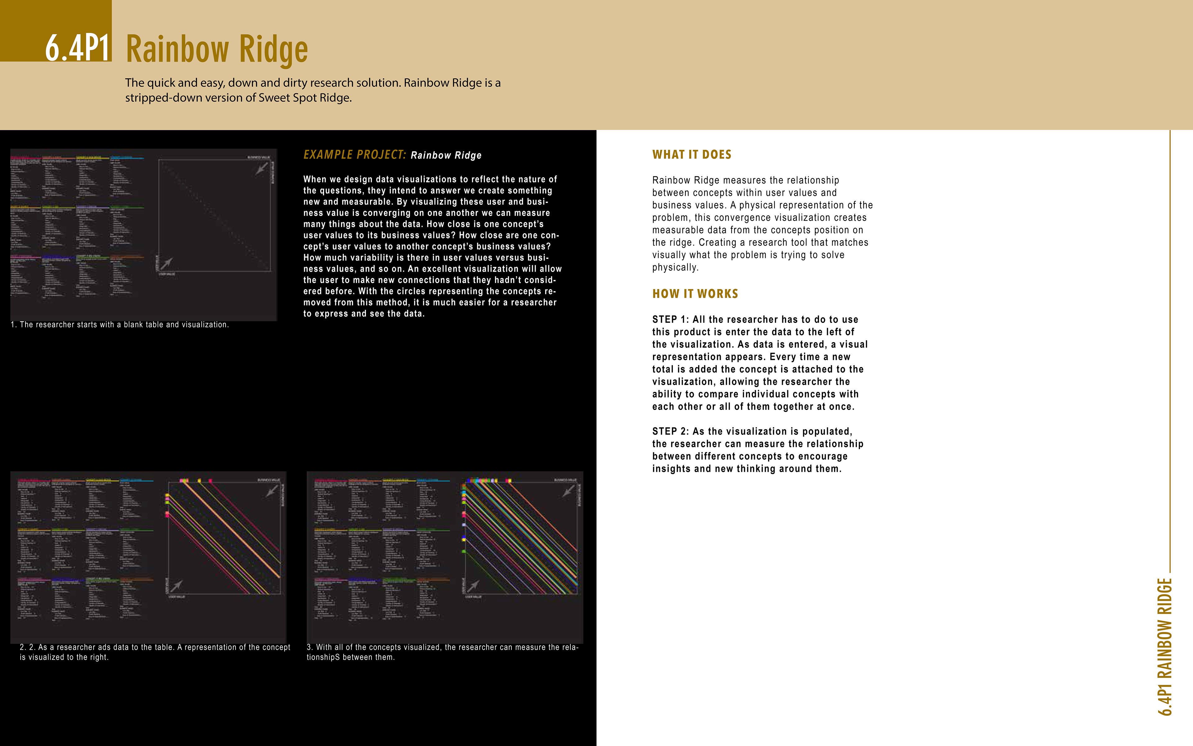
Next, I created an interactive product which self-populates as the user enters data into the table to the left of the visualization. I remove the circles from the image to make it easier for researchers to measure data sets and their relationship to one another.
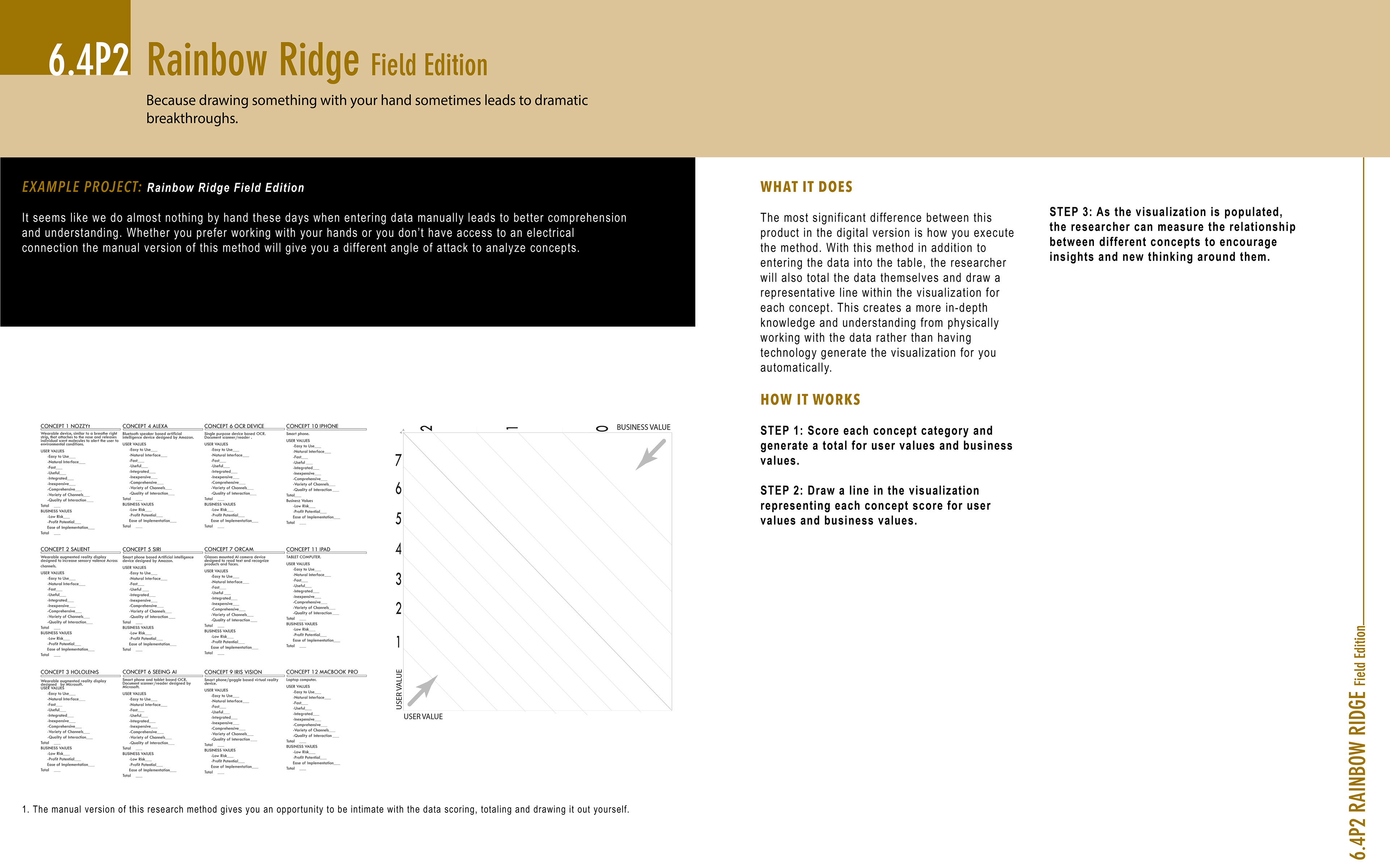
Finally, I created an analog version of the design. Users can fill out the data fields and then draw the lines into the visualization themselves to have a more intimate relationship with the data.